11 Lecture 4 Exercises
This tutorial was created by John Santos (with minor adaptations from me).
11.1 Practice exercises
From lecture:
Using the “fertil2” dataset from “wooldridge” on women living in the Republic of Botswana in 1988,
- produce a scatterplot with number of children (children) on the y axis and education (educ) on the x axis;
- how do the two variables appear to be related?;
- estimate the regression equation of the number of children on education (note: we say to regress y on x);
- interpret \(\hat{\beta_0}\) and \(\hat{\beta_1}\) ;
- plot the regression line on the scatterplot;
- calculate \(SST\), \(SSE\) and \(SSR\). Verify that \(SST = SSE + SSR\);
- using \(SST\) , \(SSE\) and \(SSR\), calculate the R 2 of the regression. Verify it is the same as the R 2 reported in the summary of your regression output;
- interpret the \(R^2\) of the regression.
From tutorial:
Using the sample 2019 CES dataset provided by John, look at how feeling thermometer ratings of Justin Trudeau (feel_trudeau) vary by an individual’s support for free market principles (marketlib).
- Produce a scatterplot of the two variables with a regression line visualized;
- Describe the relationship (i.e. is it positive or negative);
- Run the regression and report the coefficients and what they mean;
- Calculate the predicted rating for Justin Trudeau at the following levels of market liberalism: the lower tertile (33rd percentile), the mean, the upper quartile (75 percentile), and the maximum;
- Explain how well market liberalism explains how someone rates Justin Trudeau; and
- Explain what might be in the u term of the model.
11.2 Writing math in RStudio
We write math in RStudio by enclosing equations within dollar signs ($).
\(y = mx + b\)
We can centre an equation on a new line by enclosing it within two dollar signs.
\[y = mx + b\]
Subscript is denoted by an underscore (_) and superscript by a caret (^).
\[y = B_0 + B_1x_1 + u\]
Special symbols (greek letters, hats, etc.) are prefaced with a backslash (\) and sometimes enclosed in curly braces ({}).
\[ y = \beta_0 + \beta_1x_1 + u\]
\[ \hat{y} = \hat{\beta_0} + \hat{\beta}_1x_1\]
11.3 STOP!!
Before you continue, try solving the exercises on your own. It’s the only way you will learn. Then, come back to this page and see how well you did.
11.5 Lecture exercises (Solutions)
library(wooldridge)
data('fertil2')
11.5.1 Q1. Produce a scatterplot with number of children (children) on the y axis and education (educ) on the \(x\) axis
Here, I use ggplot2 to make the scatterplot. You could also use Base R graphics, but I find ggplot2 easier (especially because it’s party of the tidyverse and follows the same conventions).
Note, in ggplot2, you can have your command ggplot() command span several lines, which are connected using a + sign. This makes facilitates building your graph layer-by-layer, which is easier, more readable, and easier to troubleshoot.
library(ggplot2)
ggplot(fertil2) +
  aes(x = educ, y = children) +
  geom_point() +
  labs(x = "Education (years)",
       y = "Number of children",
       title = "Number of children by years of education")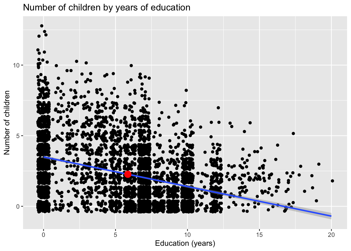
To add some random noise (a.k.a. jitter), include the argument position = "jitter" within the geom_point() function call.
ggplot(fertil2) +
  aes(x = educ, y = children) +
  geom_point(position = "jitter") +
  labs(x = "Education (years)",
       y = "Number of children",
       title = "Number of children by years of education (with jitter)")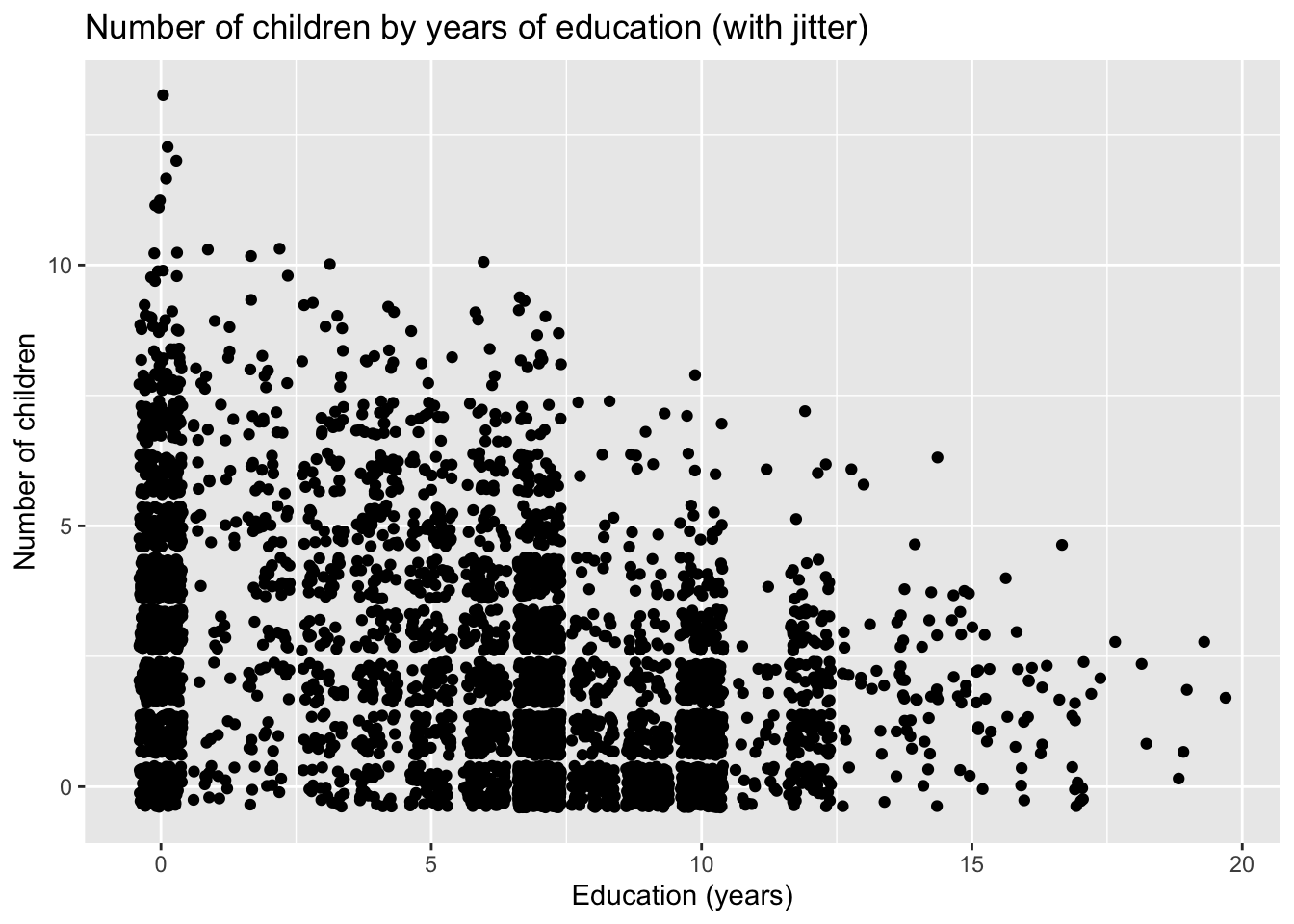
11.5.3 Q3. Estimate the regression equation of the number of children on education (note: we say “to regress \(y\) on \(x\)”);
## select: dropped 25 variables (mnthborn, yearborn, age, electric, radio, …)##
## Call:
## lm(formula = children ~ educ, data = dat)
##
## Residuals:
## Min 1Q Median 3Q Max
## -3.495 -1.496 -0.399 1.182 9.505
##
## Coefficients:
## Estimate Std. Error t value Pr(>|t|)
## (Intercept) 3.49554 0.05612 62.28 <2e-16 ***
## educ -0.20965 0.00796 -26.34 <2e-16 ***
## ---
## Signif. codes: 0 '***' 0.001 '**' 0.01 '*' 0.05 '.' 0.1 ' ' 1
##
## Residual standard error: 2.064 on 4359 degrees of freedom
## Multiple R-squared: 0.1373, Adjusted R-squared: 0.1371
## F-statistic: 693.7 on 1 and 4359 DF, p-value: < 2.2e-16Remember, the equation of the population model is:
\[children = \beta_0 + \beta_1educ + \mu \]
Our regression equation is:
\[\hat{children} = 3.496 - .210educ\]
\[n = 4361, R^2 = 0.137\]
11.5.4 Q4. Interpret \(\hat{\beta_0}\) and \(\hat{\beta_1}\);
\(\hat{\beta_0} = 3.5\). This is the intercept (or constant), which is the value of \(\hat{y}\) when all coefficients equal 0. This means a woman with no education would be predicted to have 3.5 children.
\(\hat{\beta_1} = -0.2\). This is the coefficient for educ. This means that, on average, for every additional year of schooling a women has, we would predict her to have 0.2 fewer children.
11.5.5 Q5. Plot the regression line on the scatterplot;
There are a few ways to do this. First, we could generate predictions, save them to the data set, and then plot them.
Running the lm() function automatically calculates the predictions (also know as fitted values or y-hats), so we can just extract them from the model object. They are stored in the slot $fitted.values.
Here, I take the fitted values and store them in a new column called “yhat.”
dat$yhat <- model1$fitted.valuesAnother way to retrieve the fitted values is with the command fitted.values(). It produces exactly the same results as $fitted.values, as can be seen below.
dat$yhat2 <- fitted.values(model1)
dat$yhat[1:10] == dat$yhat2[1:10]
## [1] TRUE TRUE TRUE TRUE TRUE TRUE TRUE TRUE TRUE TRUEIf we plot just the fitted values against our x-axis, we’d get a graph that looks like this:
library(ggplot2)
ggplot(dat) +
  aes(x = educ, y = yhat) +
  geom_point() +
  labs(x = "Education (years)",
       y = "Predicted number of children",
       title = "Predicted number of children by years of education")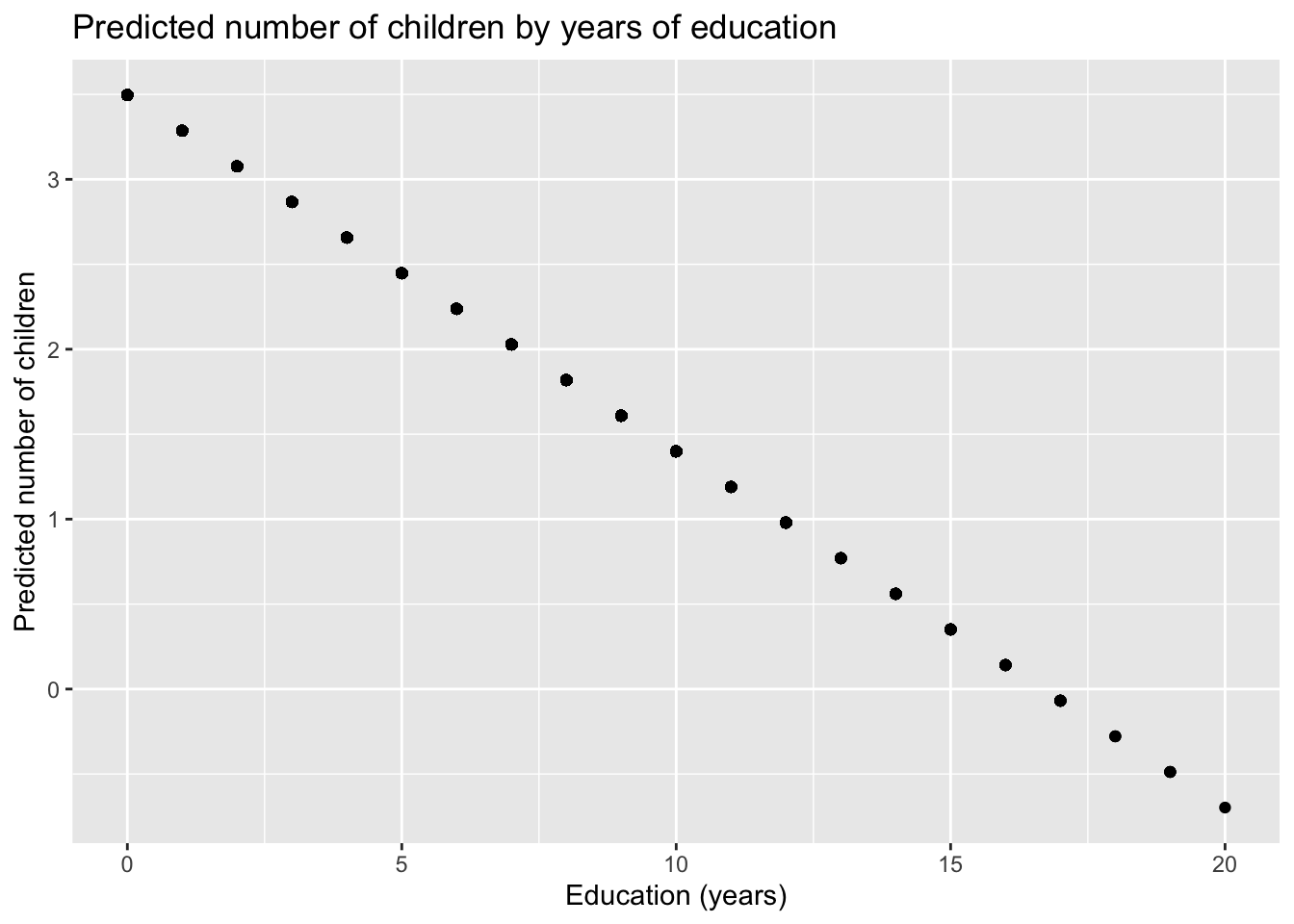
There is a predict() function. This function is used to calculate predicted values, given some combination of values we input for the \(x\)’s in our model.
Theoretically, we could use this to get our y-hats by not specifying new values. However, because of the mechanics of how this function works, it doesn’t produce exactly the same values as using $fitted.values or fitted.values() (though it comes very very very very close).
dat$yhat3 <- predict(model1)
dat$yhat[1:10] == dat$yhat3[1:10]
## [1] FALSE FALSE FALSE FALSE FALSE FALSE FALSE FALSE FALSE FALSEYou could also calculate the predictions manually using the coefficients. In practice, you wouldn’t actually do this; this is just to show you the math that R is doing behind-the-scenes.
dat$calcpreds <- model1$coefficients[[1]] + (model1$coefficients[[2]] * dat$educ)
tibble(
  "fitted.values()" = dat$yhat,
  "predict()" = dat$yhat3,
  "Manual calculation" = dat$calcpreds) %>%
  head()
## # A tibble: 6 × 3
## `fitted.values()` `predict()` `Manual calculation`
## <dbl> <dbl> <dbl>
## 1 0.980 0.980 0.980
## 2 0.770 0.770 0.770
## 3 2.45 2.45 2.45
## 4 2.66 2.66 2.66
## 5 1.19 1.19 1.19
## 6 2.03 2.03 2.03Finally, what you should avoid doing is to make your calculations by entering numbers manually (i.e. not retrieving them from the model object). You should put off rounding your numbers until the very end, lest it throw off subsequent calculations.
In our example, the numbers aren’t that different (see the 4th column below). But, that doesn’t mean you’ll always be able to get away with this.
dat$roundpreds <- 3.496 + (-0.210 * dat$educ)
tibble(
  "fitted.values()" = dat$yhat,
  "predict()" = dat$yhat3,
  "Manual calculation" = dat$calcpreds,
  "Rounded calculation" = dat$roundpreds) %>%
  head()
## # A tibble: 6 × 4
## `fitted.values()` `predict()` `Manual calculation` `Rounded calculation`
## <dbl> <dbl> <dbl> <dbl>
## 1 0.980 0.980 0.980 0.976
## 2 0.770 0.770 0.770 0.766
## 3 2.45 2.45 2.45 2.45
## 4 2.66 2.66 2.66 2.66
## 5 1.19 1.19 1.19 1.19
## 6 2.03 2.03 2.03 2.03Regardless of how we calculate the predictions, we can add them to our original ggplot() statement as a geom_line().
ggplot(dat) +
  geom_point(aes(x = educ, y = children), position = "jitter") +
  geom_line(aes(x = educ, y = yhat), color = "red", linewidth = 1) +
  labs(x = "Education (years)",
       y = "Number of children",
       title = "Number of children by years of education")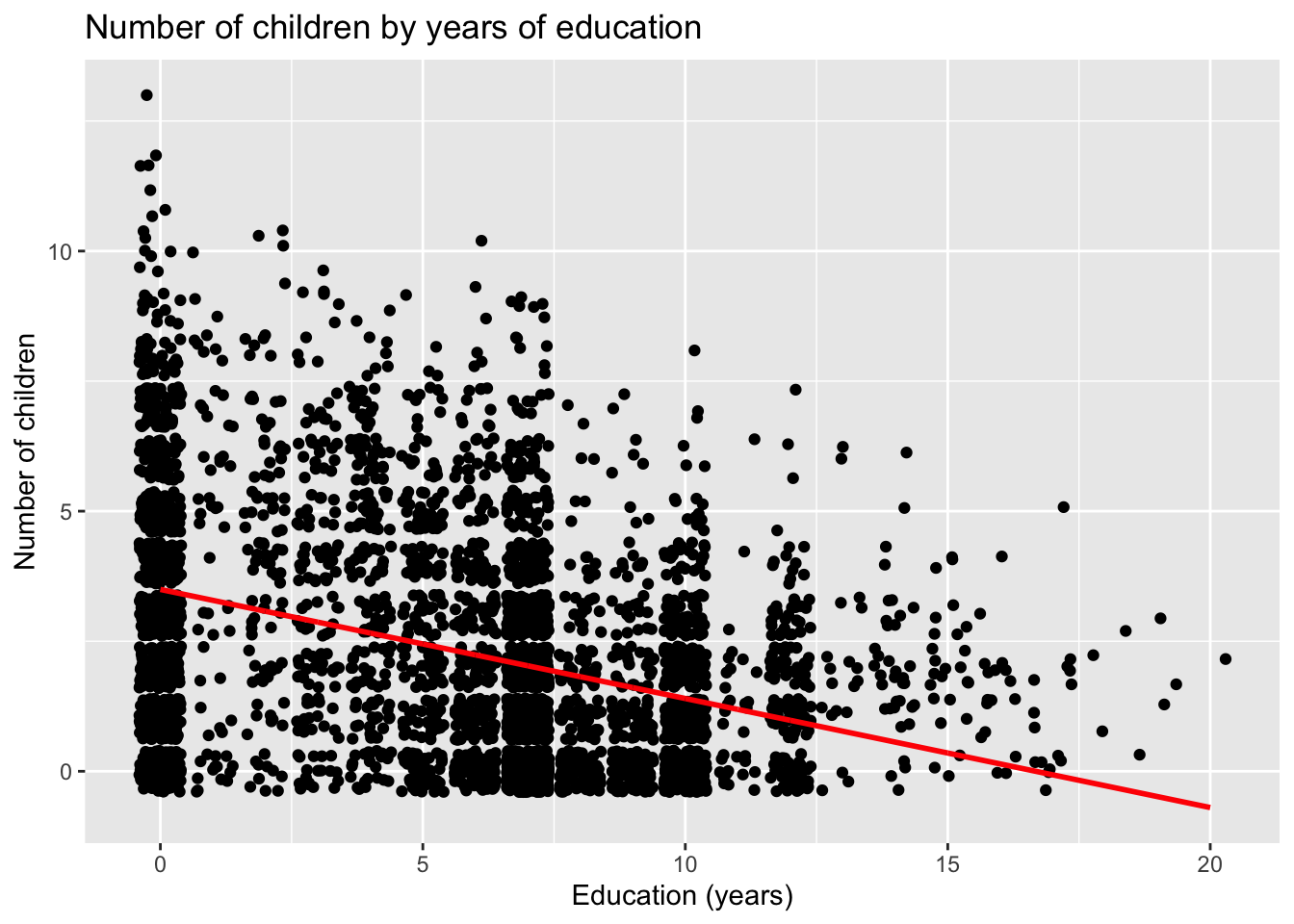
For a simple (or bivariate) regression, the simplest way to add a regression line is to make use of the command geom_smooth(), which is built into ggplot2.
In this example, I’ve also added an addition geom_point() command with its own aesthetics mapped to the mean values for our predictor and response variables. This is to show that the point with the coordinates \([\bar{educ},\bar{children}]\) (i.e. \([5.9, 2.3]\) is always on the regression line.
ggplot(dat, aes(x = educ, y = children)) +
  geom_point(position = "jitter") +
  geom_smooth(method = "lm", fullrange = FALSE) +
  labs(x = "Education (years)",
       y = "Number of children",
       title = "Number of children by years of education") +
  geom_point(aes(x = mean(dat$educ), y = mean(dat$children)), color = "red", size = 4)
## `geom_smooth()` using formula = 'y ~ x'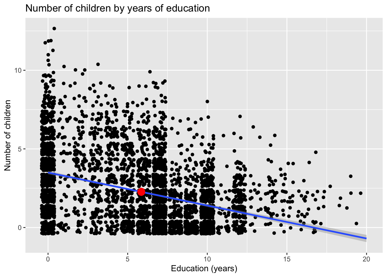
11.5.6 Q6. Calculate SST, SSE and SSR. Verify that \(SST = SSE + SSR\);
First, we’ll generate our predictions.
dat$childrenhat <- model1$fitted.valuesCalculate \(SST\) (sum of squares TOTAL).
Our formula, in words, could be interpreted as, the total sum of squares is equal to the sum of all of the squared differences between an observed Y and the average of Y.
\[SST = \Sigma{ ^n_{i=1} ( y_i - \bar{y} )^2 }\]
## [1] 21527.18Calculate \(SSE\) (sum of squares EXPLAINED).
In words, this formula could be interpreted as, the explained sum of squares is equal to the sum of all of the squared differences between a predicted Y and the average of Y.
\[SSE = \Sigma{ ^n_{i=1} ( \hat{y}_i - \bar{y} )^2 }\]
## [1] 2955.401Calculate \(SSR\) (sum of squares RESIDUAL).
\[SST = \Sigma{ ^n_{i=1} \hat{u_i}^2 }\]
model1_ssr <- model1_sst - model1_sse
model1_ssr
## [1] 18571.78A model’s residuals are stored in the slot $residuals, and we can use those as inputs into the calculation. We can also retrieve them using the resid() function.
sum(model1$residuals^2)## [1] 18571.78## [1] 18571.78The manual calculations above are mostly for pedagogical purposes. In practice, there are pre-built functions that calculate these quantities for us.
We can use the anova() function to display the ANOVA table of the regression, which shows the various sum-of-squares statistics.
anova(model1)## Analysis of Variance Table
##
## Response: children
## Df Sum Sq Mean Sq F value Pr(>F)
## educ 1 2955.4 2955.40 693.67 < 2.2e-16 ***
## Residuals 4359 18571.8 4.26
## ---
## Signif. codes: 0 '***' 0.001 '**' 0.01 '*' 0.05 '.' 0.1 ' ' 1Note that the total sum of squares is not reported in the ANOVA table, but is easily calculated.
## [1] 21527.1811.5.7 Q7. Using \(SST\), \(SSE\) and \(SSR\), calculate the \(R^2\) of the regression. Verify it is the same as the \(R^2\) reported in the summary of your regression output;
The proportion of variance of Y explained by X is a simple ratio of \(SSE/SST\).
model1_sse / model1_sst## [1] 0.137287We can check this against what the model reports…
summary(model1)##
## Call:
## lm(formula = children ~ educ, data = dat)
##
## Residuals:
## Min 1Q Median 3Q Max
## -3.495 -1.496 -0.399 1.182 9.505
##
## Coefficients:
## Estimate Std. Error t value Pr(>|t|)
## (Intercept) 3.49554 0.05612 62.28 <2e-16 ***
## educ -0.20965 0.00796 -26.34 <2e-16 ***
## ---
## Signif. codes: 0 '***' 0.001 '**' 0.01 '*' 0.05 '.' 0.1 ' ' 1
##
## Residual standard error: 2.064 on 4359 degrees of freedom
## Multiple R-squared: 0.1373, Adjusted R-squared: 0.1371
## F-statistic: 693.7 on 1 and 4359 DF, p-value: < 2.2e-16Note that the residual standard error is 2.064 on 4359 degrees of freedom. This is equal to the standard deviation of the residuals (\({\sqrt{\hat{\sigma^2}}}\)) (which makes sense because we use a model’s SDs as approximations for the population’s SEs).
sd(model1$residuals)## [1] 2.06387511.6 Additional practice exercises
Using the 2019 CES dataset, look at how feeling thermometer ratings of Justin Trudeau (feel_trudeau) vary by an individual’s support for free market principles (marketlib).
For your analysis…
- Produce a scatterplot of the two variables with a regression line visualized;
- Describe the relationship (i.e. is it positive or negative);
- Run the regression and report the coefficients and what they mean;
- Calculate the predicted rating for Justin Trudeau at the following levels of market liberalism: the lower tertile (33rd percentile), the mean, the upper quartile (75 percentile), and the maximum;
- Explain how well market liberalism explains how someone rates Justin Trudeau; and
- Explain what might be in the \(\mu\) term of the model.
11.7 STOP!!
Before you continue, try solving the exercises on your own. It’s the only way you will learn. Then, come back to this page and see how well you did.
11.8 Continue
Before I answer the questions, I’m going to start by looking at the summary statistics of my variables.
summary(ces$feel_trudeau)## Min. 1st Qu. Median Mean 3rd Qu. Max. NA's
## 0.00 7.00 50.00 44.85 75.00 100.00 2409
sd(ces$feel_trudeau, na.rm = TRUE)## [1] 34.54668
summary(ces$marketlib)## Min. 1st Qu. Median Mean 3rd Qu. Max. NA's
## 0.00 6.00 9.00 8.59 11.00 16.00 32684
sd(ces$marketlib, na.rm = TRUE)## [1] 3.519915On average, Canadians rate Trudeau about 45 points out of a 100 on the feeling thermometer scale (SD = 34.5), and score at about 8.6 on the market liberalism scale (SD = 3.5), which ranges from 0 to 16.
11.8.1 Q1. Produce a scatterplot of the two variables with a regression line visualized
ggplot(ces, aes(x = marketlib, y = feel_trudeau)) +
  geom_point(position = "jitter") +
  geom_smooth(method = "lm") +
  labs(x = "Market liberalism",
       y = "Feeling thermometer ratings of Trudeau",
       title = "Trudeau ratings by market liberalism") +
  theme_minimal()
## `geom_smooth()` using formula = 'y ~ x'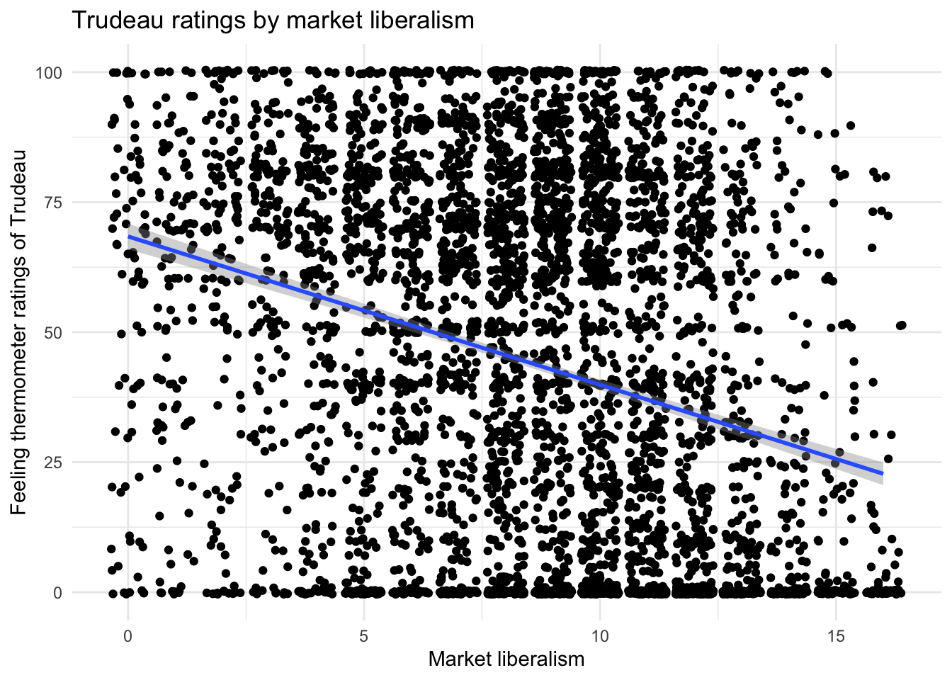
11.8.2 Q2. Describe the relationship (i.e. is it positive or negative)
There appears to be a negative relationship between market liberalism and ratings of Trudeau–i.e. as support for free market principles increases, positive feelings towards Trudeau decrease.
This can be difficult to see without the regression line because both variables have upper and lower bounds (i.e. they do not go onto infinity).
In these situations, look at diagonal pairs of corners that are denser than the opposite diagonal. Here, the top left and bottom right corners are denser than the bottom left and top right corners.
11.8.3 Q3. Run the regression and report the coefficients and what they mean
##
## Call:
## lm(formula = feel_trudeau ~ marketlib, data = ces)
##
## Residuals:
##     Min      1Q  Median      3Q     Max
## -68.399 -31.323   0.121  28.677  74.382
##
## Coefficients:
##             Estimate Std. Error t value Pr(>|t|)
## (Intercept)  68.3989     1.2546   54.52   <2e-16 ***
## marketlib    -2.8520     0.1352  -21.10   <2e-16 ***
## ---
## Signif. codes:  0 '***' 0.001 '**' 0.01 '*' 0.05 '.' 0.1 ' ' 1
##
## Residual standard error: 33.11 on 4795 degrees of freedom
##   (32936 observations deleted due to missingness)
## Multiple R-squared:  0.08496,    Adjusted R-squared:  0.08477
## F-statistic: 445.2 on 1 and 4795 DF,  p-value: < 2.2e-16
Regressing feel_trudeau on marketlib gives us the following regression equation:
\[\hat{feel\_trudeau} = 68.399 + -2.852marketlib\] \[n = 4797, R^2 = 0.085\]
Our results indicate that, for every one-point increase in market liberalism (on a scale from 0 to 16), the rating of Trudeau decreases, on average, by 2.9 points. Moving halfway (8 points) across the scale (e.g. the difference between the far left and the centre or between the centre and the far right) would result in a shift of about 23 points on average (2.9 * 8 = 23.2).
The intercept tells us that the average rating of Justin Trudeau when market liberalism is 0 (i.e. the left-most position) is 68.399.
11.8.4 Q4. Calculate the predicted rating for Justin Trudeau at the following levels of market liberalism: the lower tertile (33rd percentile), the mean, the upper quartile (75 percentile), and the maximum
First, let’s find the ratings of Trudeau at the quantiles of interest.
The quantile() function gives us the values at the 0th (min), 25th (lower quartile), 50th (i.e. median), 75th (upper quartile), and 100th (max) percentiles. Note, if your data set has missing values, you have to use the option na.rm = TRUE, otherwise the function does not work.
quantile(ces$marketlib, na.rm = TRUE)## 0% 25% 50% 75% 100%
## 0 6 9 11 16We can specify a specific value for the quantile() function to return to get the 33rd and 75th percentile.
tibble(
  "qtile33" = quantile(ces$marketlib, .33, na.rm = TRUE),
  "mean" = mean(ces$marketlib, na.rm = TRUE),
  "qtile75" = quantile(ces$marketlib, .75, na.rm = TRUE),
  "max" = max(ces$marketlib, na.rm = TRUE))
## # A tibble: 1 × 4
## qtile33 mean qtile75 max
## <dbl> <dbl> <dbl> <dbl>
## 1 7 8.59 11 16There are a few ways we can calculate predicted probabilities.
First, we could do the math manually and plug the value of market liberalism into our regression equation. Let’s do that for the 33rd percentile of market liberalism (\(marketlib=7\)).
68.399 + (-2.852 * 7)## [1] 48.435To avoid rounding errors, it’s better to use the actual coefficients returned by our model, which we can retrieve using coefs() or $coefficients. Here’s what that looks like for the example above.
jtmod$coefficients[[1]] +
  (jtmod$coefficients[[2]] *  quantile(ces$marketlib, .33, na.rm = TRUE))
## 33%
## 48.43472Finally, we can also use the predict() function and specify the values for our coefficient using the argument newdata=. Here’s the same example in that format.
predict(jtmod,
        newdata = data.frame(
          marketlib = quantile(ces$marketlib, .33, na.rm = TRUE)
          )
        ) %>%
  unname()
## [1] 48.43472Let’s continue using the predict() function to calculate our predicted values when marketlib is at the mean (8.59).
predict(jtmod,
        newdata = data.frame(marketlib = mean(ces$marketlib, na.rm = TRUE))) %>%
  unname()
## [1] 43.91406Here, we predict feel_trudeau when marketlib is at the 75th percentile.
predict(jtmod,
        newdata = data.frame((marketlib = quantile(ces$marketlib, .75, na.rm = TRUE)))) %>%
  unname()
## [1] 37.0266predict() for the max value for marketlib.
predict(jtmod,
        newdata = data.frame((marketlib = max(ces$marketlib, na.rm = TRUE)))) %>%
  unname()
## [1] 22.7664511.8.5 Q5. Explain how well market liberalism explains ratings of Justin Trudeau
In our simple regression model, \(R^2=0.085\). This means that market liberalism explains about 8.5% of the variation in feeling thermometer ratings of Justin Trudeau. Another way to think about this is that knowing someone’s score on the market liberalism scale improves our ability to predict by 8.5% over a guess based on only knowing the average market liberalism of Canadians as a whole.
This doesn’t seem too surprising, given that we would expect self-reported ideology to have a relationship with ratings of a party leader, but so would many other factors.
11.8.6 Q6. Explain what might be in the u term of the model
Obviously, there are many more things besides market liberalism that go into how someone rates Justin Trudeau. Some factors that are likely correlated with both market liberalism and ratings of Justin Trudeau—and, as such, are likely to be a source of omitted variable bias—include one’s stand on social or moral issues (often called moral traditionalism), one’s party identification, evaluations of economic conditions, and personal characteristics (often called “socio-demographics”).
11.9 Bonus content
11.9.1 Looking inside model objects…
Model objects created by lm() are a list that contain various quantities of interest. Let’s take a look inside. We can do this using the command View(model1) (note the capital “V” in “View”).
We can also look at the names of each item in our model1 object using the command names(model1).
# View(model1)
names(model1)
## [1] "coefficients" "residuals" "effects" "rank"
## [5] "fitted.values" "assign" "qr" "df.residual"
## [9] "xlevels" "call" "terms" "model"Notice that while we can see the coefficients, we’re missing things like the standard errors, t-statistics, and p-values. While it’s actually relatively easy to calculate these by doing math on the variance-covariance matrix, we’re not at that point yet.
The easiest way to get those quantities is by getting them from the model summary table.
We’re used to printing this out using the summary() command. However, we can also assign the output of that command to an object, and then get the values we want from the item $coefficients.
##  [1] "call"          "terms"         "residuals"     "coefficients"
##  [5] "aliased"       "sigma"         "df"            "r.squared"
##  [9] "adj.r.squared" "fstatistic"    "cov.unscaled"
mysummary$coefficients## Estimate Std. Error t value Pr(>|t|)
## (Intercept) 3.4955406 0.056123844 62.28263 0.000000e+00
## educ -0.2096504 0.007960142 -26.33752 5.413817e-142Note, if you assign mysummary$coefficients to a object, you’ll find out that it’s actually an array of numbers, which makes it a bit tricky to extract it’s contents.
mycoefs <- mysummary$coefficients
mycoefs
## Estimate Std. Error t value Pr(>|t|)
## (Intercept) 3.4955406 0.056123844 62.28263 0.000000e+00
## educ -0.2096504 0.007960142 -26.33752 5.413817e-142
class(mycoefs)## [1] "matrix" "array"We can get around this by telling R to treat the object like it’s a data frame using the as.data.frame() command.
mycoefs1 <- as.data.frame(mysummary$coefficients)
class(mycoefs1)
## [1] "data.frame"
mycoefs1## Estimate Std. Error t value Pr(>|t|)
## (Intercept) 3.4955406 0.056123844 62.28263 0.000000e+00
## educ -0.2096504 0.007960142 -26.33752 5.413817e-142Now we can work with it like other data frames and extract columns using the $ operator.
Note, because of the space and special characters in some of the columns, we need to use backticks (i.e. the ` character, or the “lower-case tilde”) around the variable names.
mycoefs1$Estimate## [1] 3.4955406 -0.2096504
mycoefs1$`Std. Error`## [1] 0.056123844 0.00796014211.9.2 How SE, t, and p are calculated
If you’re curious how we calculate the Standard Errors, t-values, and p-values of our coefficients, the chunk below shows the equations.
The SEs are the square root of the diagonal of the variance-covariance matrix (you won’t have to know this for the course).
The t-values (or t-statistics) are the quotients of the coefficients divided by the SEs (i.e. \(\frac{b_i}{SE_i}\)).
The p-values are the integrals of the t-distribution evaluated at the absolute values of the t-values, given the residual degrees of freedom of the model (for the course, you’ll be doing this using a statistical table, but knowing how to do this in R comes in handy).
data.frame(
  b = model1$coefficients,
  se = sqrt(diag(vcov(model1))),
  t = model1$coefficients / sqrt(diag(vcov(model1))),
  p = 2 * pt(abs(model1$coefficients / sqrt(diag(vcov(model1)))),
             model1$df.residual, lower.tail = FALSE))
## b se t p
## (Intercept) 3.4955406 0.056123844 62.28263 0.000000e+00
## educ -0.2096504 0.007960142 -26.33752 5.413817e-142