3 Lecture 2: Introduction to Causal Inference
Slides
- 3 Introduction to Causal Inference (link)
3.1 Introduction
We now dive deeper into causal inference and the counterfactual problem. We show why randomized trials solve the counterfactual problem, but also why it remains a challenge when using observational data.
The lecture slides are displayed in full below:
Figure 3.1: Slides for 3 Introduction to Causal Inference.
3.2 Vignette 2.1
Usually, we do not know the data-generating process, but here, we are gods. Let’s create a world where taking treatment A (e.g., taking a pill) positively affects Y (e.g., health) by one unit. Let’s run an experiment.
df <- data.frame(
  # Simulate baseline health outcomes *without* treatment for 5,000 individuals
  health_no_pill = rnorm(5000),
  # Randomly assign treatment: pill = 1 (treated) or 0 (control)
  pill = sample(c(0, 1), 5000, replace = TRUE)
)

# Visualize the distribution of baseline (no-pill) health outcomes
hist(df$health_no_pill)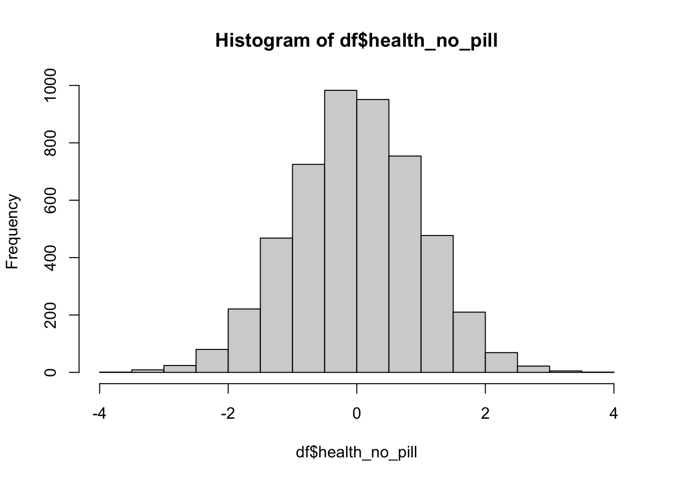
| Var1 | Freq |
|---|---|
| 0 | 2490 |
| 1 | 2510 |
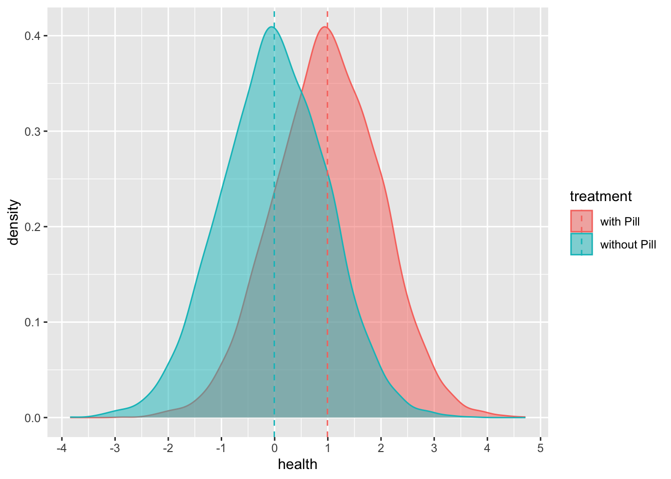
Now we can create our counterfactual:
df <- df %>%
  # Define the potential outcome under treatment (A = 1):
  # health_w_pill = health_no_pill + 1 implies a constant treatment effect of +1 for everyone.
  mutate(health_w_pill = health_no_pill + 1) # Y(1): the potential outcome if treated
Let’s look at our counterfactual:
# Reshape the two potential outcomes into a long format for easy plotting/comparison
health_w_pill <- cbind.data.frame(df$health_w_pill, "with Pill")
colnames(health_w_pill) <- c("health", "treatment")

health_no_pill <- cbind.data.frame(df$health_no_pill, "without Pill")
colnames(health_no_pill) <- c("health", "treatment")

# Stack the two datasets to compare distributions under treatment vs. no treatment
comparison_y <- rbind.data.frame(health_w_pill, health_no_pill)

comparison_y %>%
  group_by(treatment) %>%
  # Compute group means (used to add mean lines to the plot)
  mutate(mean_health = mean(health)) %>%
  ungroup() %>%
  ggplot(aes(x = health, fill = treatment, color = treatment)) +
  # Plot the distribution of health outcomes under each condition
  geom_density(alpha = 0.5) +
  scale_x_continuous(breaks = scales::pretty_breaks(n = 8)) +
  # Add dashed vertical lines at the mean health for each condition
  geom_vline(
    aes(xintercept = mean_health, color = treatment),
    linetype = "dashed"
  )
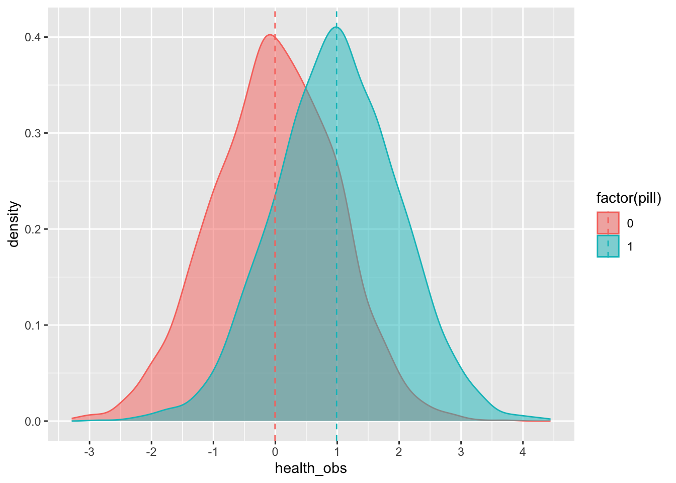
Now let’s give each individual the treatment (either the pill or a placebo):
df <- df %>%
  # Construct the observed outcome:
  # - if pill == 1, we observe the treated potential outcome Y(1)
  # - if pill == 0, we observe the untreated potential outcome Y(0)
  mutate(health_obs = ifelse(pill == 1, health_w_pill, health_no_pill))

# Inspect the first 10 rows to verify the observed outcome was assigned correctly
head(df, 10)
## health_no_pill pill health_w_pill health_obs
## 1 -0.15030748 0 0.8496925 -0.15030748
## 2 -0.32775713 0 0.6722429 -0.32775713
## 3 -1.44816529 0 -0.4481653 -1.44816529
## 4 -0.69728458 0 0.3027154 -0.69728458
## 5 2.59849023 0 3.5984902 2.59849023
## 6 -0.03741501 0 0.9625850 -0.03741501
## 7 0.91349189 1 1.9134919 1.91349189
## 8 -0.18452650 0 0.8154735 -0.18452650
## 9 0.60982430 0 1.6098243 0.60982430
## 10 -0.05272681 1 0.9472732 0.94727319We can see the average effect of the pill on the treated group (remember from the lecture that the effect is, in essence, the difference between those who receive the treatment and those who do not):
df %>%
  # Compare average observed health outcomes for treated (pill = 1) vs. control (pill = 0)
  group_by(pill) %>%
  summarize(health = mean(health_obs))
## # A tibble: 2 × 2
## pill health
## <dbl> <dbl>
## 1 0 -0.00436
## 2 1 0.991Or we can plot it:
df %>%
  group_by(pill) %>%
  # Compute the mean observed health within treated vs. control groups
  mutate(mean_health_obs = mean(health_obs)) %>%
  ungroup() %>%
  ggplot(aes(x = health_obs, fill = factor(pill), color = factor(pill))) +
  # Plot the distribution of observed outcomes by treatment status
  geom_density(alpha = 0.5) +
  scale_x_continuous(breaks = scales::pretty_breaks(n = 8)) +
  # Add dashed vertical lines at the group means
  geom_vline(
    aes(xintercept = mean_health_obs, color = factor(pill)),
    linetype = "dashed"
  )
3.3 Vignette 2.2
Ok… but what happens if we cannot randomize? What if we have observational data, such that…
df <- data.frame(income = runif(10000)) %>%
  # Simulate baseline health without treatment (Y(0)).
  # Here, health depends on a random component plus income (so income confounds health).
  mutate(
    health_no_pill = rnorm(10000) + income,
    # Define the treated potential outcome (Y(1)) with a constant +1 treatment effect
    health_w_pill = health_no_pill + 1
  ) %>%
  # Assign treatment non-randomly: only higher-income individuals receive the pill
  mutate(
    pill = income > 0.7,
    # Construct the observed outcome based on treatment assignment
    health_obs = ifelse(pill == 1, health_w_pill, health_no_pill)
  )

# Inspect the first 10 rows
head(df, 10)
## income health_no_pill health_w_pill pill health_obs
## 1 0.8380111 0.3204987 1.3204987 TRUE 1.3204987
## 2 0.1661114 1.1382593 2.1382593 FALSE 1.1382593
## 3 0.2536757 0.7137704 1.7137704 FALSE 0.7137704
## 4 0.4388608 0.2464646 1.2464646 FALSE 0.2464646
## 5 0.7179361 0.6193669 1.6193669 TRUE 1.6193669
## 6 0.8533989 0.5162593 1.5162593 TRUE 1.5162593
## 7 0.4451843 1.5447185 2.5447185 FALSE 1.5447185
## 8 0.7091194 1.4534526 2.4534526 TRUE 2.4534526
## 9 0.4332221 0.3342665 1.3342665 FALSE 0.3342665
## 10 0.7808074 -0.1309316 0.8690684 TRUE 0.8690684Let’s see what happens now to the estimated mean average ‘effect’ (remember from the lecture that the effect is, in essence, the difference between those who receive the treatment and those who do not):
## # A tibble: 2 × 2
##   pill  health
##   <lgl>  <dbl>
## 1 FALSE  0.317
## 2 TRUE   1.86
Oh no! That is more than the true effect of the pill, which we know is 1 because we created it. However, if we model this properly (this is an RDD!), then—remember from the lecture that the effect is, in essence, the difference between those who receive the treatment and those who do not:
df %>%
  # Keep observations close to the cutoff (income = 0.7),
  # mimicking the local comparison at the heart of a regression discontinuity design (RDD)
  filter(abs(income - 0.7) < 0.01) %>%
  # Compare mean observed outcomes just below vs. just above the cutoff
  group_by(pill) %>%
  summarize(health = mean(health_obs)) # BOOM!!
## # A tibble: 2 × 2
## pill health
## <lgl> <dbl>
## 1 FALSE 0.707
## 2 TRUE 1.663.4 Lecture Assignment
Using simulated data, describe (in text) and show (with plots) a plausible situation where a treatment has an effect, but the observed outcome is null. Tip: Before committing to an example, remember that a difference-in-differences approach requires two periods (change over time) and two groups (treatment and control).
Using a difference-in-differences approach, show how to estimate the true effect from your example.